How to use a Colour Swatch
I’m fascinated by colour — if you know this blog, you probably already suspect that!😃🎨 I find it amazing how we perceive colour, and how pigments and dyes can create new hues and tonalities.
During my Uni years, I remember my first ceramics class and all the swatches they used for glazing. Swatches are really fundamental because colours can change a lot with heat, when pottery goes into the kiln. The only way to know what the final colour will look like is to keep a record of the pigment mixture with a sample after glazing and firing.
The rooms were filled with wooden boards displaying hundreds of little colourful squares of glazed ceramic, each one with a small recipe underneath showing the pigments used and their proportions. It was like a beautiful mosaic of colour and information, built up over the years by students and teachers.
Quite charming and organised — especially in contrast with us goofy newbies, with clay all over our hands and clothes.😃
I think my appreciation for swatches started right there.
A swatch is a tiny experiment.
It isn’t just a sample of the pencil’s colour – it’s an efficient helper!
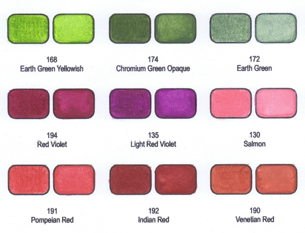
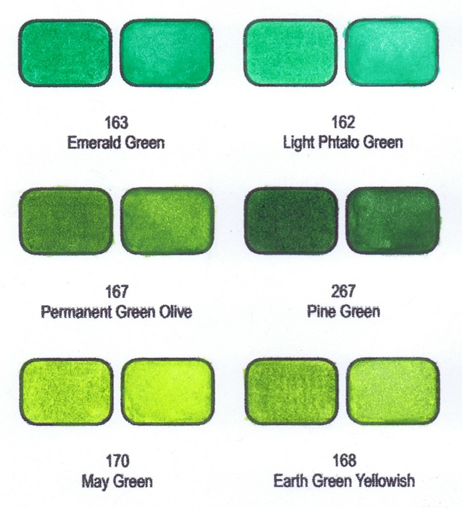
A good swatch can record:
- the colour at light, medium and heavy application;
- how quickly the material builds up;
- how transparent or opaque it is;
- how well it layers;
- what happens when two colours overlap;
- how the colour behaves on different papers;
- how water-soluble materials look dry versus activated;
- whether a pencil can be removed or erased;
- whether a marker bleeds or feathers;
- what colours work together in a palette;
- which colours in different sets are close substitutes;
- which colours you own, use frequently or need to replace.
All that makes the chart a working colour library – way more than an just inventory page.
Derwent recommends swatches for tracking materials and understanding how they perform, while Copic notes that paper colour, texture and absorbency can noticeably change the appearance of the same marker.
SWATCH CHARTS — QUICK GUIDE
What is a colour swatch?
A colour swatch is a small sample showing how an art material actually looks and behaves on paper.
Swatching can be as simple as filling each space with its corresponding pencil, marker or paint — or you can use each space to record much more information.
A completed chart becomes your personal colour reference. Use it to choose colours, plan palettes, compare similar shades, experiment with techniques and keep track of your collection.
The more consistently you make your swatches, the easier they are to compare.
Before You Start
Whenever possible, use the same paper or surface you normally use for your artwork. Paper colour, texture and absorbency can affect both the appearance and behaviour of art materials.
Label your chart with the brand, range and set, and keep the colour name or number beside each swatch.
There is no correct way to colour a swatch. Choose the method that is most useful to you.
Explore Ways to Colour Your Swatches
Solid Colour / Full Strength
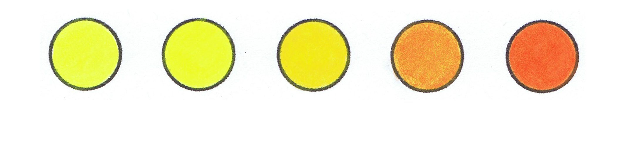
Fill the shape evenly to see the colour clearly at a strong application. With coloured pencils, build several light, even layers rather than relying only on heavy pressure.
This simple method is ideal when you mainly want a quick visual reference for your collection.
Gradient
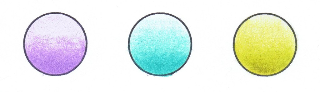
Begin with very light pressure or fewer layers and gradually build towards a darker, stronger application.
A gradient shows the range available from a single colour and helps you understand how quickly the material builds intensity.
Two-Value Test

Divide the swatch into two areas. Apply the colour lightly on one side and more strongly on the other.
This gives you an instant comparison between a lighter and darker application.
3- or 4-Step Value Test
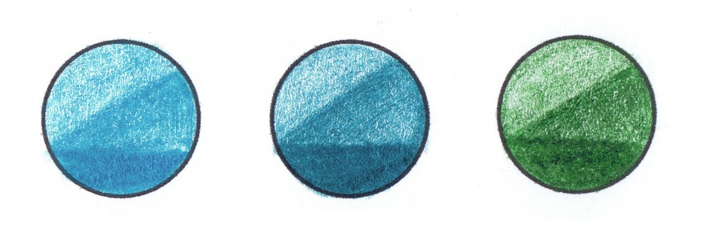

Divide the space into three or four sections and gradually increase the pressure, number of layers or amount of medium.
This creates a miniature value scale for each colour.
Target
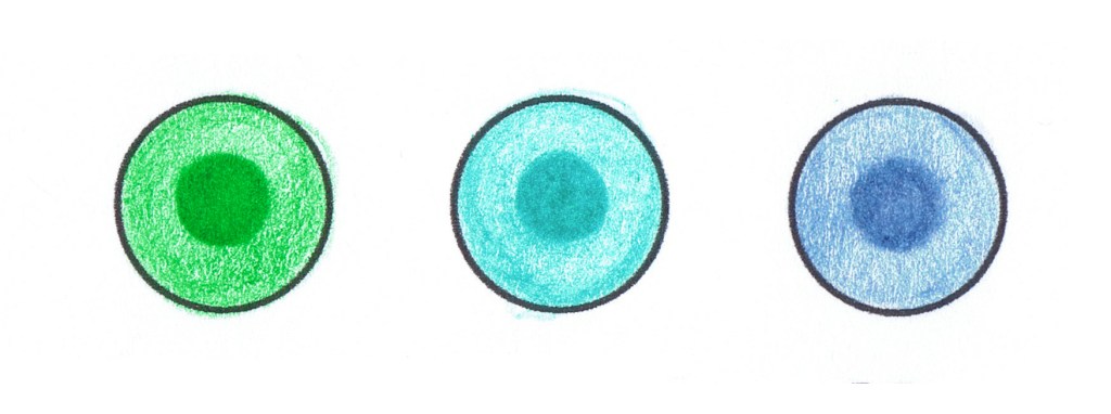
Use a lighter application around the outside and increase the colour towards the centre — or reverse the direction.
Target swatches are compact and make differences in intensity very easy to see.
Form / 3D Test
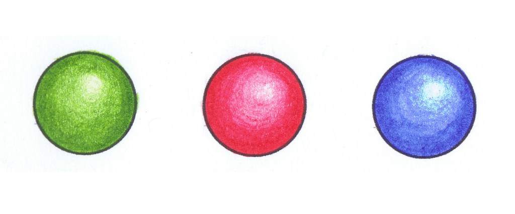
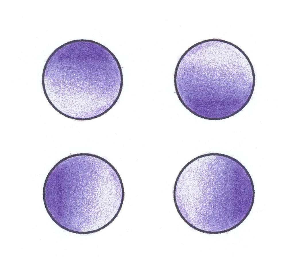
Use the swatch as a tiny sphere or form, moving gradually from light to shadow.
This is useful when you want to see how a colour behaves while creating volume rather than as a completely flat sample.
A Few Tips for Smooth Gradients
Start lightly and build colour gradually.
For coloured pencils, a sharp pencil is particularly useful in small spaces. Work with controlled, overlapping strokes and add several light layers before increasing pressure. Do not worry about making every swatch perfect. The purpose of a swatch is to record how the material behaves — not to create a miniature masterpiece.
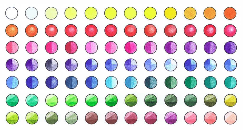
Swatches as TEST PAGES – creative ways to use your Colour Swatch Charts
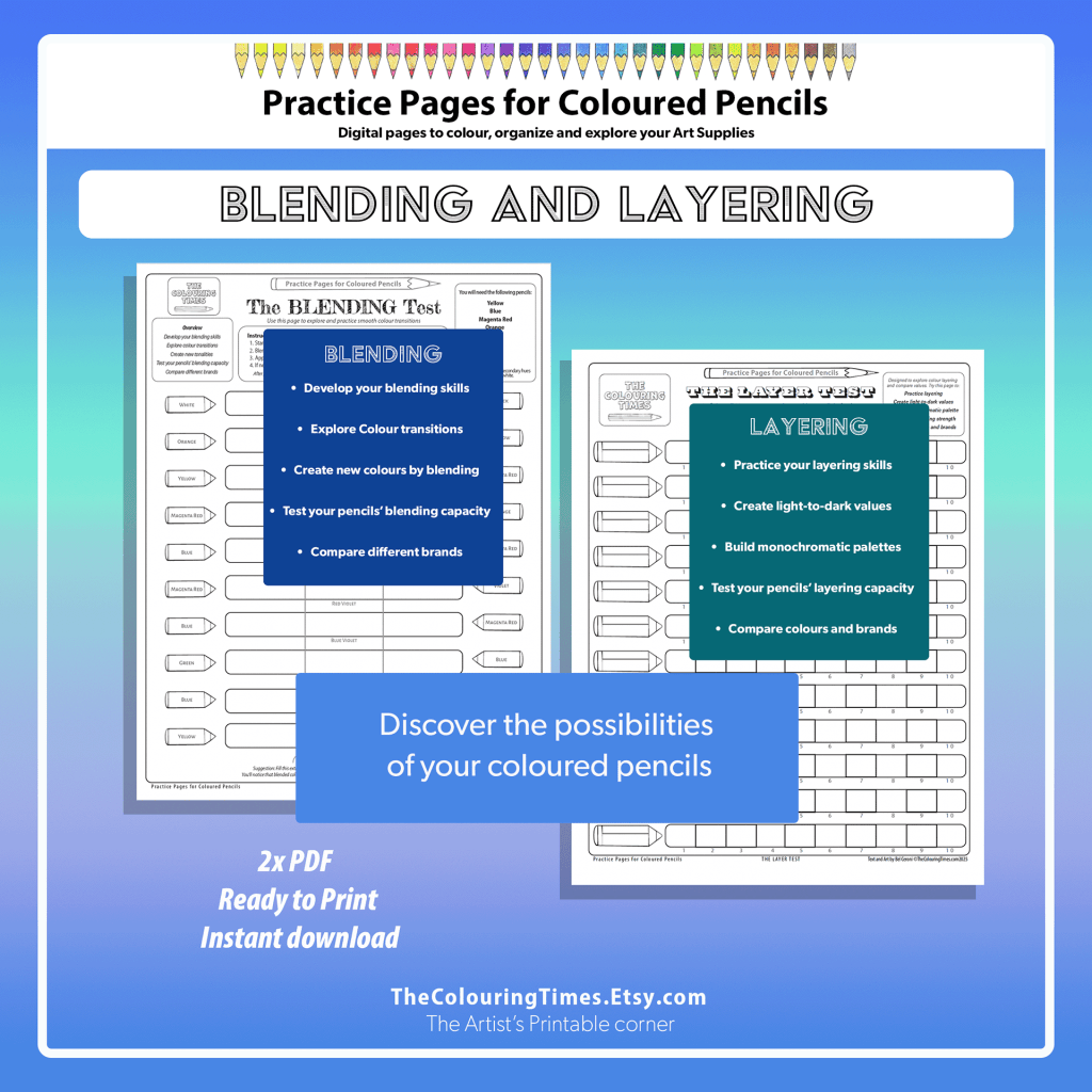
Use your Charts as Test Pages – discover the possibilities of your pencils, markers or other art supplies
Layer Test — 1 / 2 / 3 layers
Divide the shape into three areas:
Light | Medium | Heavy OR 1 layer | 2 layers | 3 layers
It shows immediately how quickly a pencil or marker builds intensity.
Copic recommends applying one, two and three layers of the same marker are used to demonstrate its gradient and versatility.
Layering Order Test- 2 colours
This is more advanced: Take two colours — for example blue and yellow.
One swatch:
Blue → Yellow
Another:
Yellow → Blue
The results are often not identical.
Copic specifically notes that changing the order in which different colours are layered can change the resulting mixture; Faber-Castell gives similar advice for water-soluble pencils.
This is very useful when you are colouring skin, foliage, fabric, shadows, etc.
New Colour Test —– A + B + C = New Colour
Rather than simply seeing two or three individual colours, combine them creating a new colour.
This can help to build your own little library of reliable colour combinations.
Don’t forget to write the colour numbers beside your experiment. That turns the chart into something you can return to months later instead of thinking, “Wonderful mauve. Which mysterious cocktail did I use to make it?” The eternal colourist problem is solved!
Dry and Wet Test for Watercolour Pencils
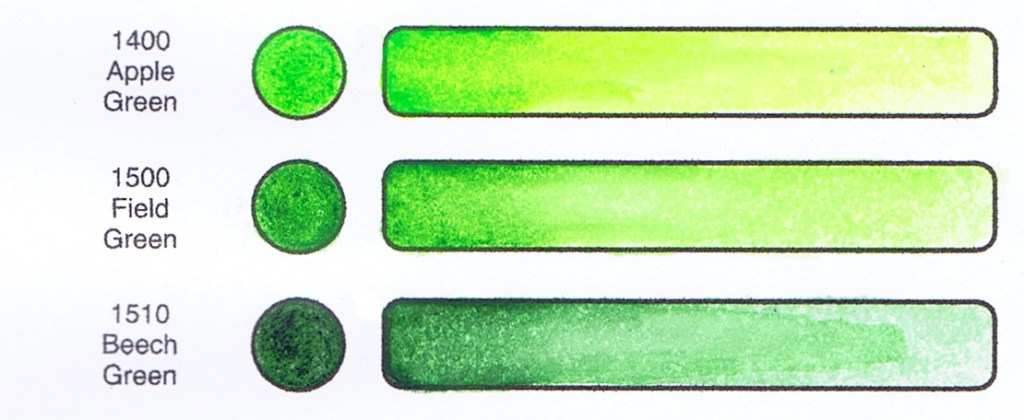
For watercolour pencils, water-soluble markers, blocks and similar media:Try half the swatch dry and activate the other half with water.
Derwent itself recommends making colour charts showing pencils both dry and wet and leaving space for favourite colour mixtures.
When using watercolour pencils, don’t forget to print your chart on a stroller paper that can support water.
Coverage Test – transparent and opaque
Apply colour over a dark line to compare transparency and opacity.
Draw a black or dark line through the swatch before applying the medium.
If the line remains clearly visible, the colour is relatively transparent. If the colour covers it strongly, it is more opaque.
Winsor & Newton demonstrates paint opacity in precisely this way — applying colours across a dark line to see how much remains visible.
For pencils this can also be done on white + grey + black paper.
Paper Test —— Supplies + Paper = Colour
The paper is part of the swatch. Yes. It’s true. Don’t skip this one: the paper is really a very important part of your swatch.
Colour, texture, tooth and absorbency can change how an art material looks and behaves. This is particularly dramatic with markers, but it also matters with coloured pencil, pastel and water-soluble media. Copic explicitly states that the same ink can appear more vivid or dull depending on the paper used.
My best advice is try using your supplies in different kinds of paper, experiment and discover which one you prefer. When possible, print your charts on the same type of paper you normally use for your artwork. If you change paper, consider making a new chart to match perfectly.
Erasing / Lifting Test
Apply → erase/lift → compare
For pencils it tells you how easily a colour can be corrected or highlighted.
For watercolour it indicates staining (ink) behaviour.
Faber-Castell specifically demonstrates using an eraser to reduce watercolour-pencil pigment, while professional watercolour manufacturers classify colours by staining (ink) behaviour.
Marker Test —– Bleed / Feather Test
Using markers? Place scrap paper underneath your chart and remember that paper type can affect colour, blending and bleed-through.
Copic notes that paper has a major effect on bleeding and recommends putting scrap paper underneath when using alcohol markers.
I hope you enjoy even more of your art supplies – colouring your best swatches!
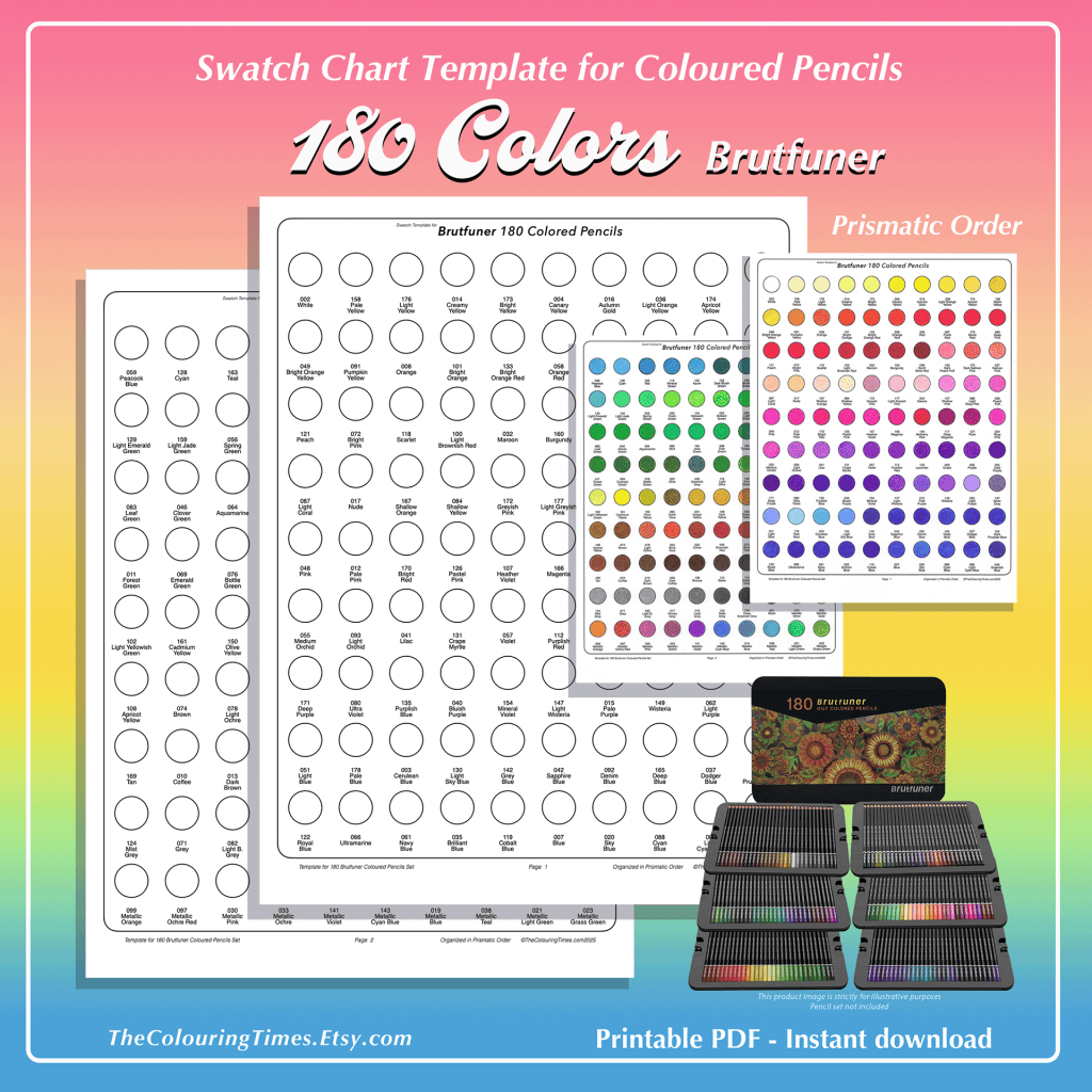
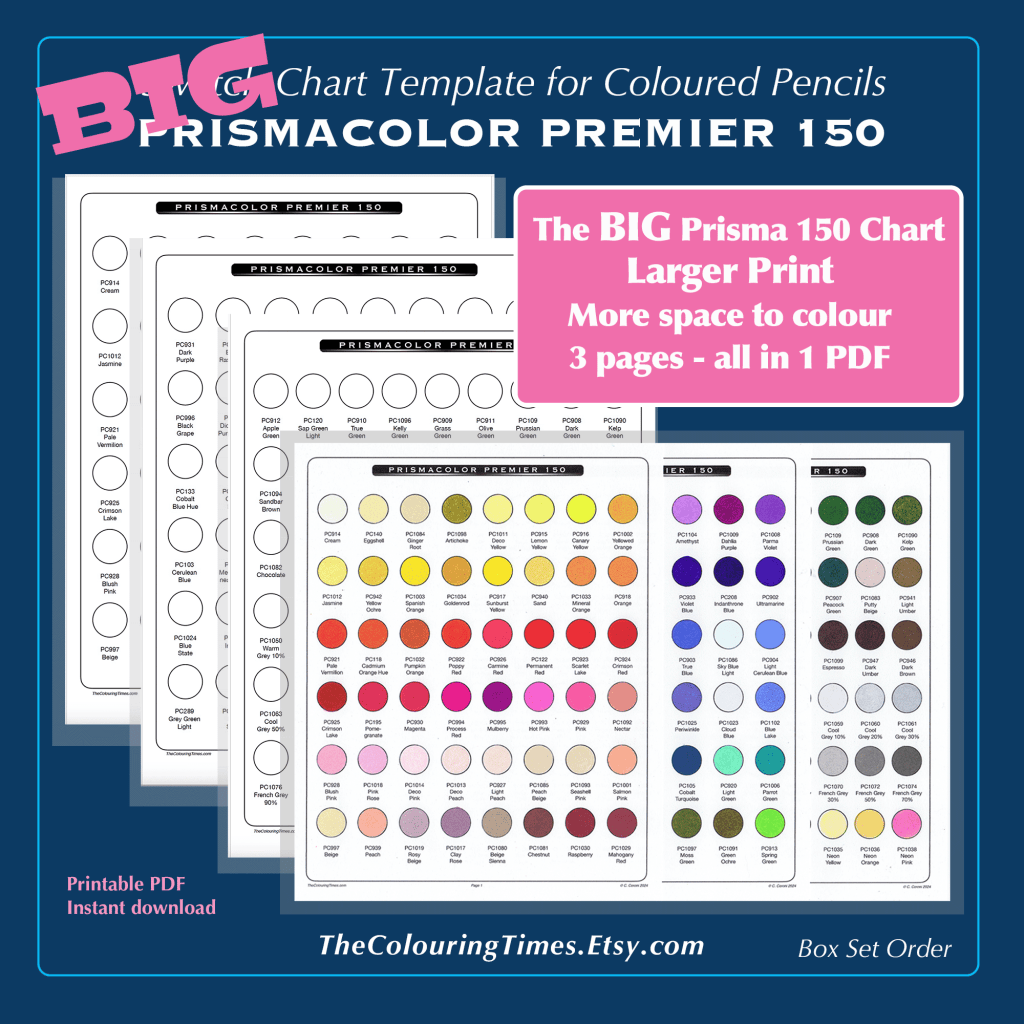
Check out my New Swatches :
Use code HELLO10 for a 10% discount when visiting my Etsy Store: TheColouringTimes.Etsy.com